OUTDOOR & PRINT
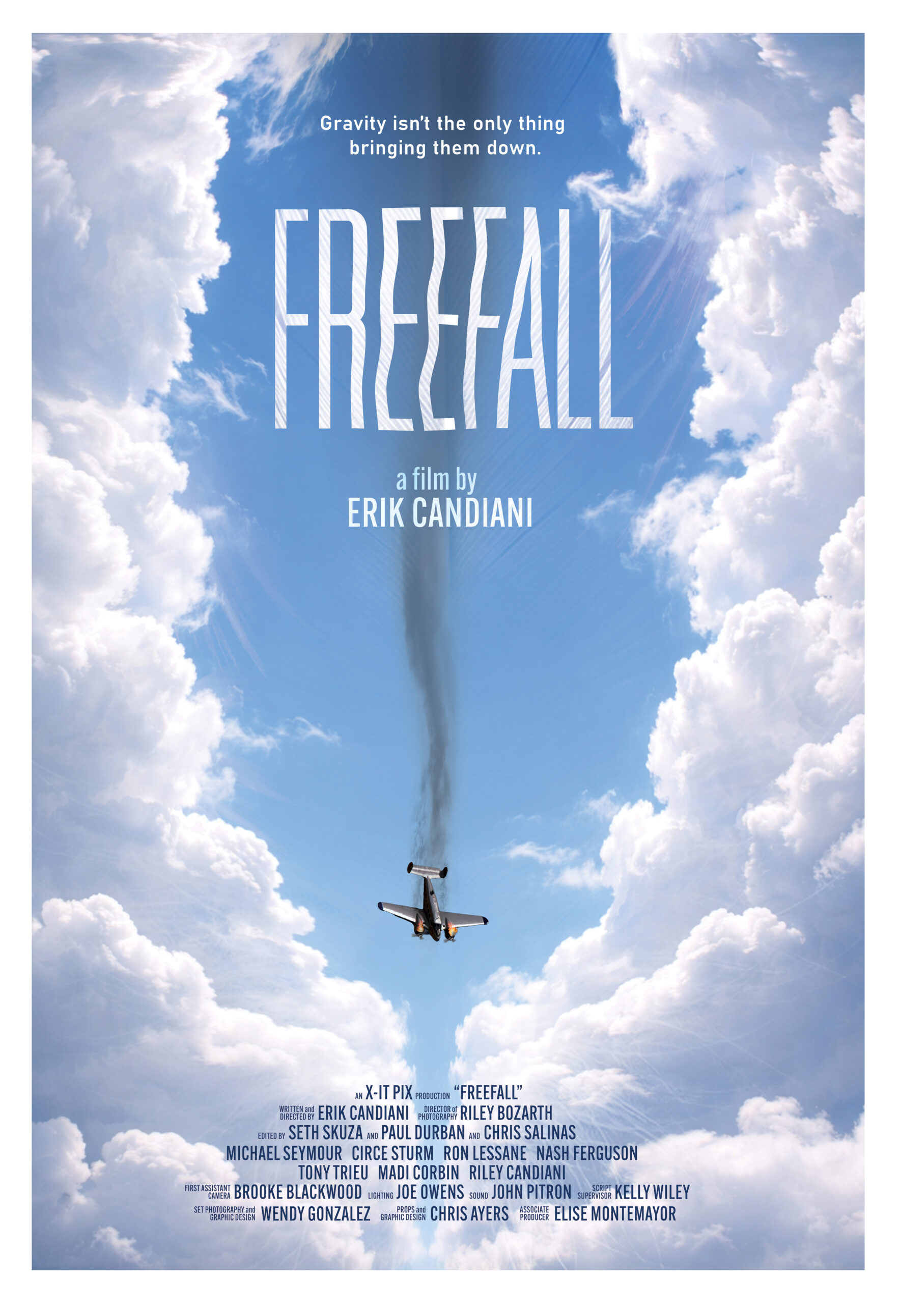
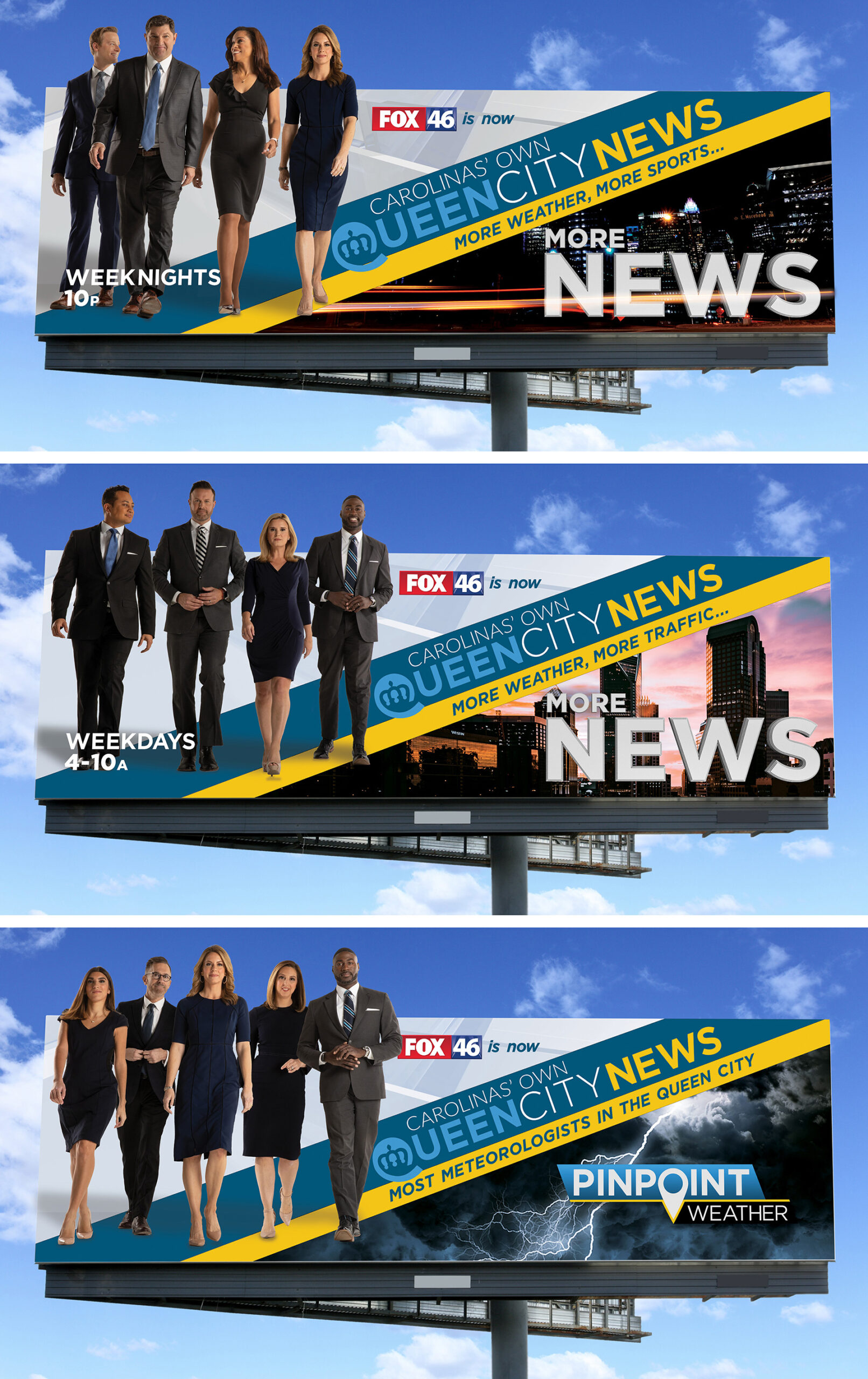
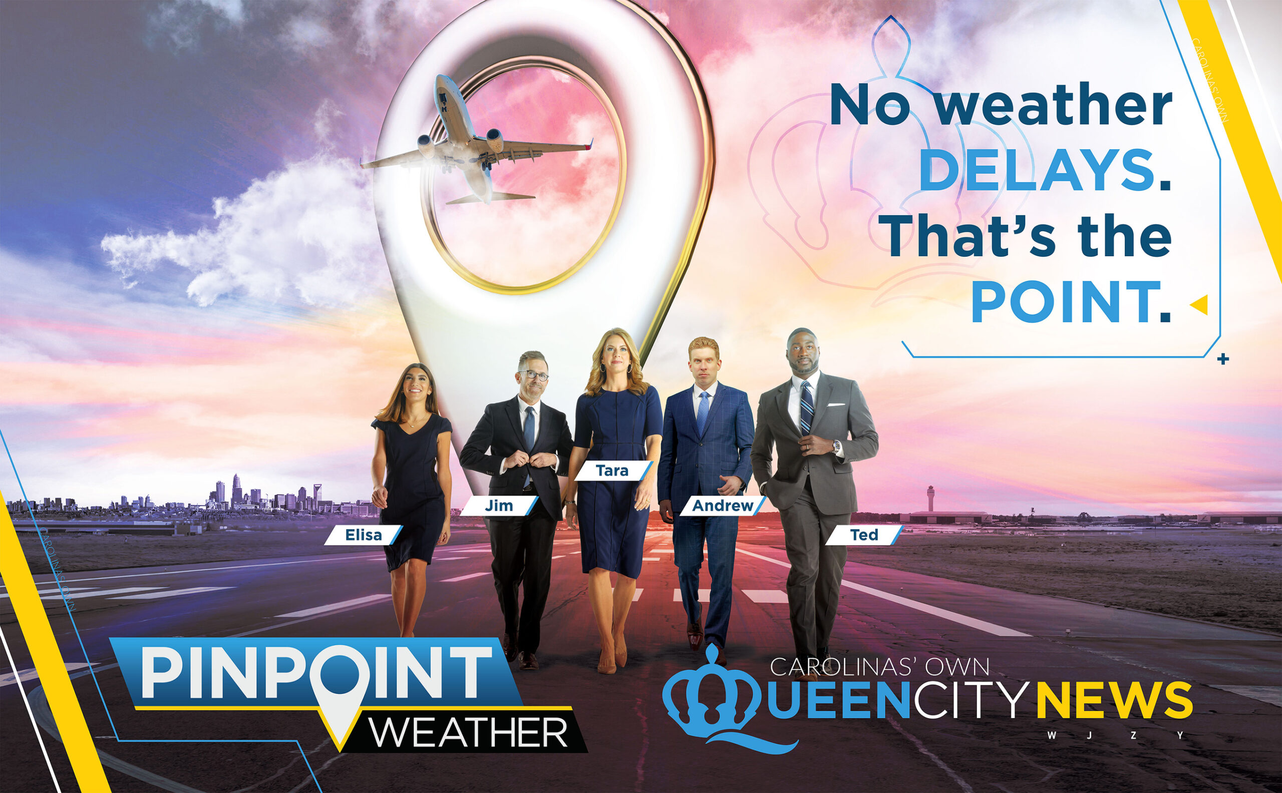
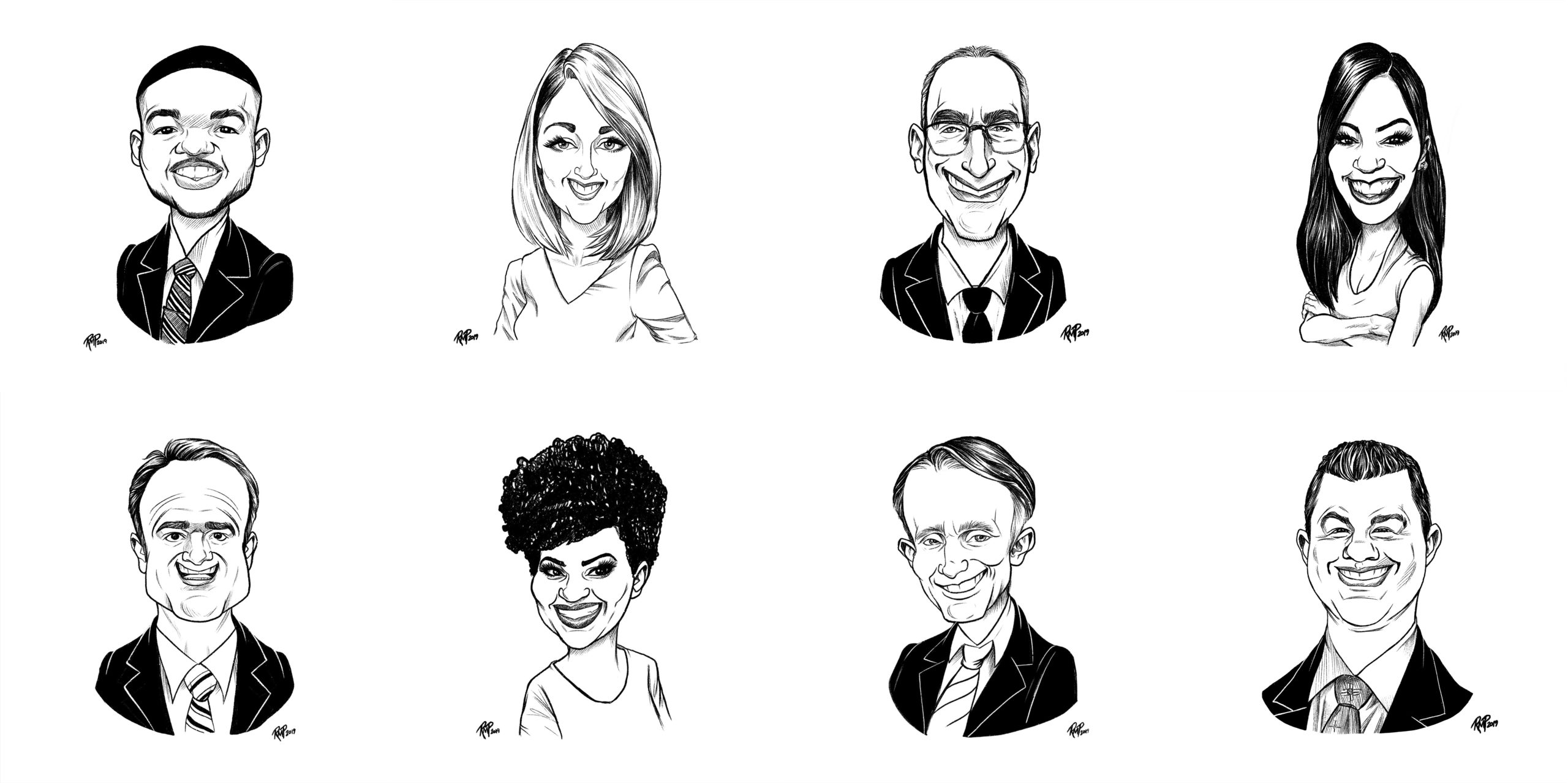
I try to steer clear of typical outdoor news promotion design and branding, to wit rows of happy, smiley faces with excessive messaging and far too much text. Occasionally, we have to go there, but for the most part I try keep them unique and clean. Solid imagery. Minimal text focusing on a single takeaway.
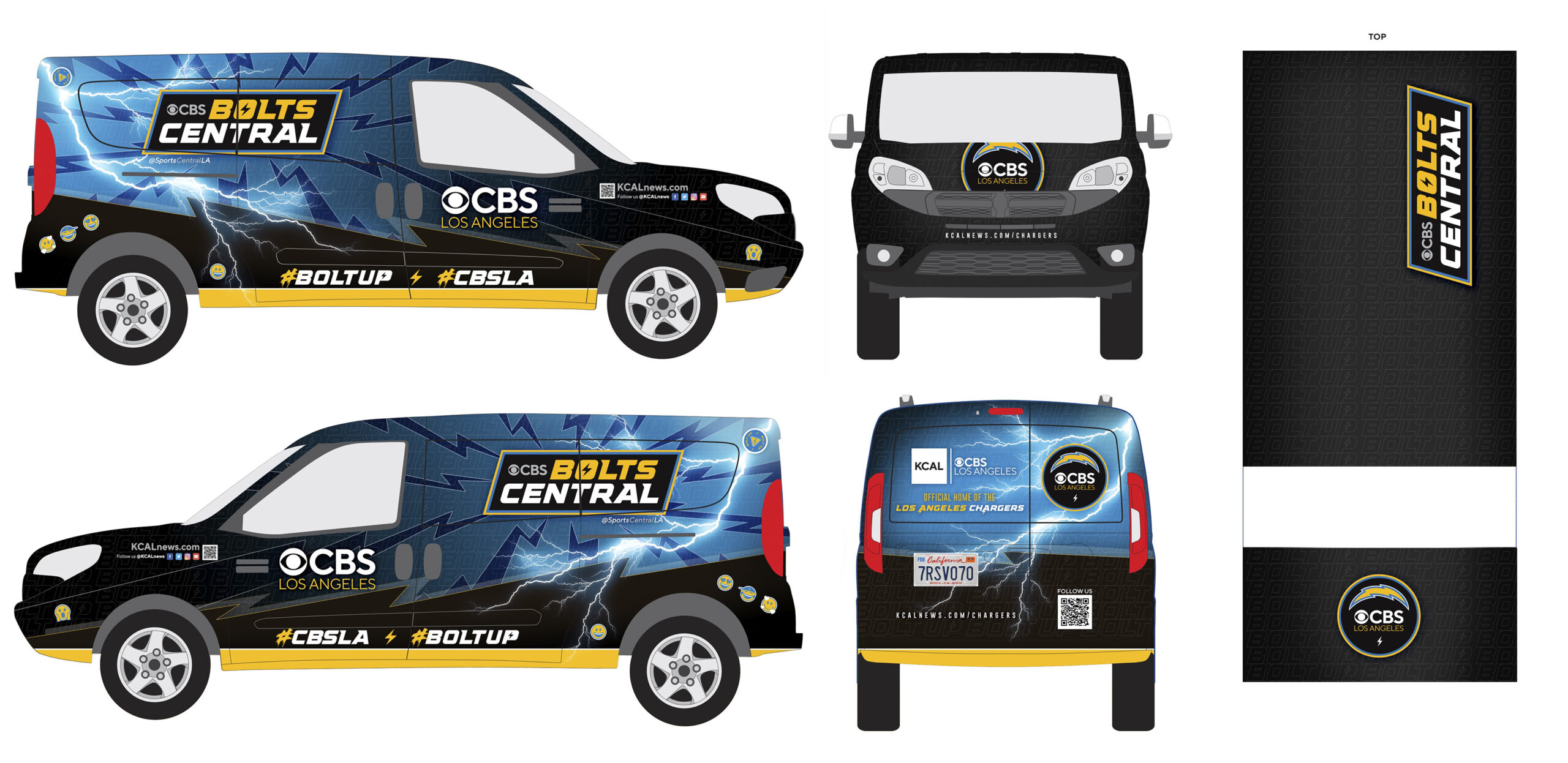
Below are a few examples of some of my department’s past campaigns, various pieces and print work.


